Project Overview page redesign
StarOfService, 2023
Problem
After the business model switch, the Project Overview page became a part of the primary client funnel. Usability tests and metrics performance highlighted room for growth.
Role
Ideated, researched, designed, and implemented experiments to redesign the user journey and increase page conversion.
Goal and results
The main goal was to increase client engagement with professionals on this page.
Over about 6 months of iterations, the share of Clients starting communication with Professionals increased almost 4 times. On the scale of the entire funnel it can be estimated as x2.2 growth.
Target page conversion
x4 increase
Entire funnel covertion
x2.2 increase
Background
StarOfService is a platform connecting clients with skilled professionals for various service needs. The Project Overview page plays a critical role in this journey, as it's where clients encounter potential matches for their requests. It functioned adequately, but usability tests and metrics performance highlighted the optimisation needed to maximise client engagement.
Within the Growth Track, I led the redesign of the Project Overview page to enhance user experience and increase client engagement with professionals.
This case study details key initiatives to illustrate the approach:
Professional cards
Understanding client's needs
Architecture transformations
Finding common ground
Open supply
Design without design
#1
Professional cards
Understanding client’s needs
Problem
The professional card is a crucial element on the page. By that moment, we used to have several views from different models from different ages — it was hard to track why some of those decisions were made and how to make it "sell" professionals to clients.
Process
Finding out the previous hiring experience;
How different profile elements affect the process comparison of professionals.
With all that I'd set to cards redesign and launched a series of AB tests to tailor the application of the findings.
Results
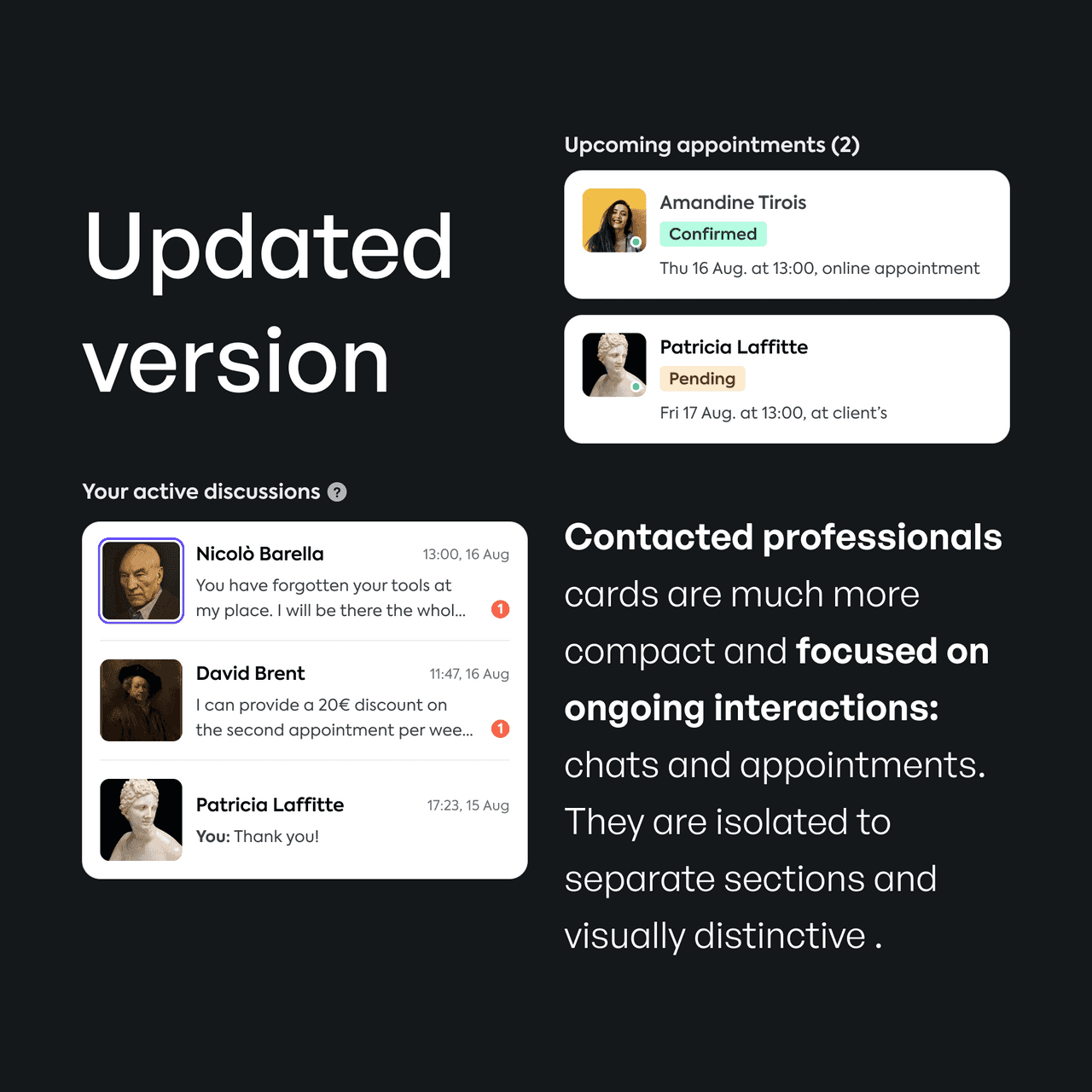
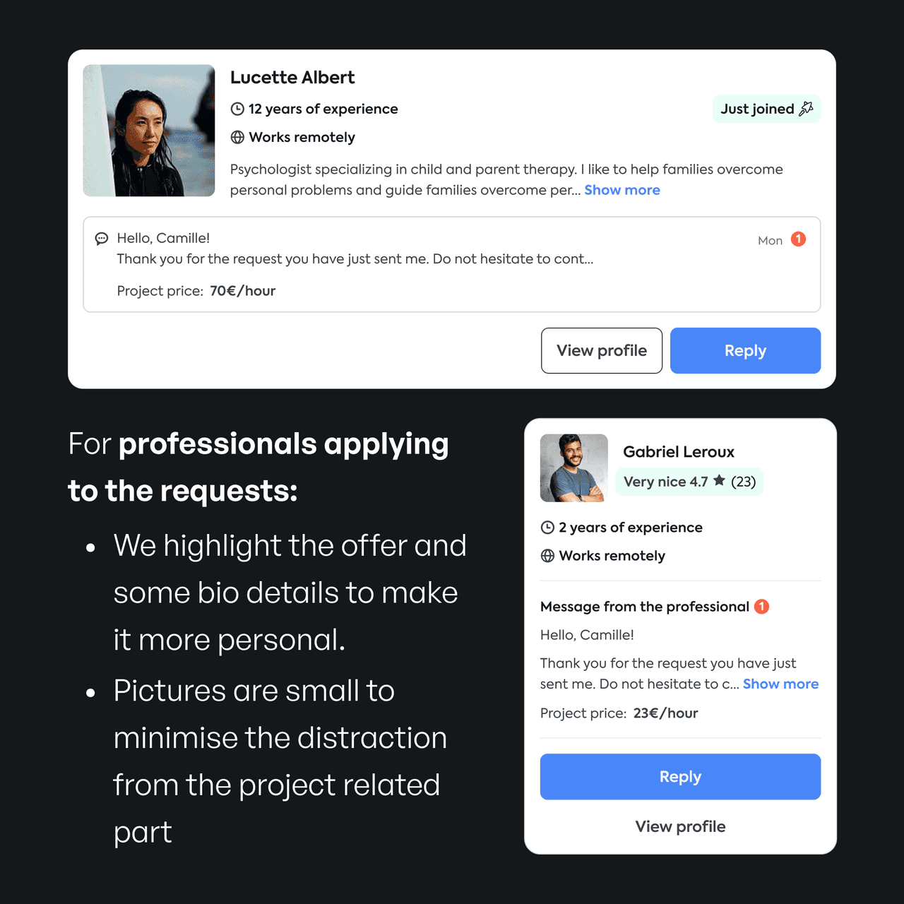
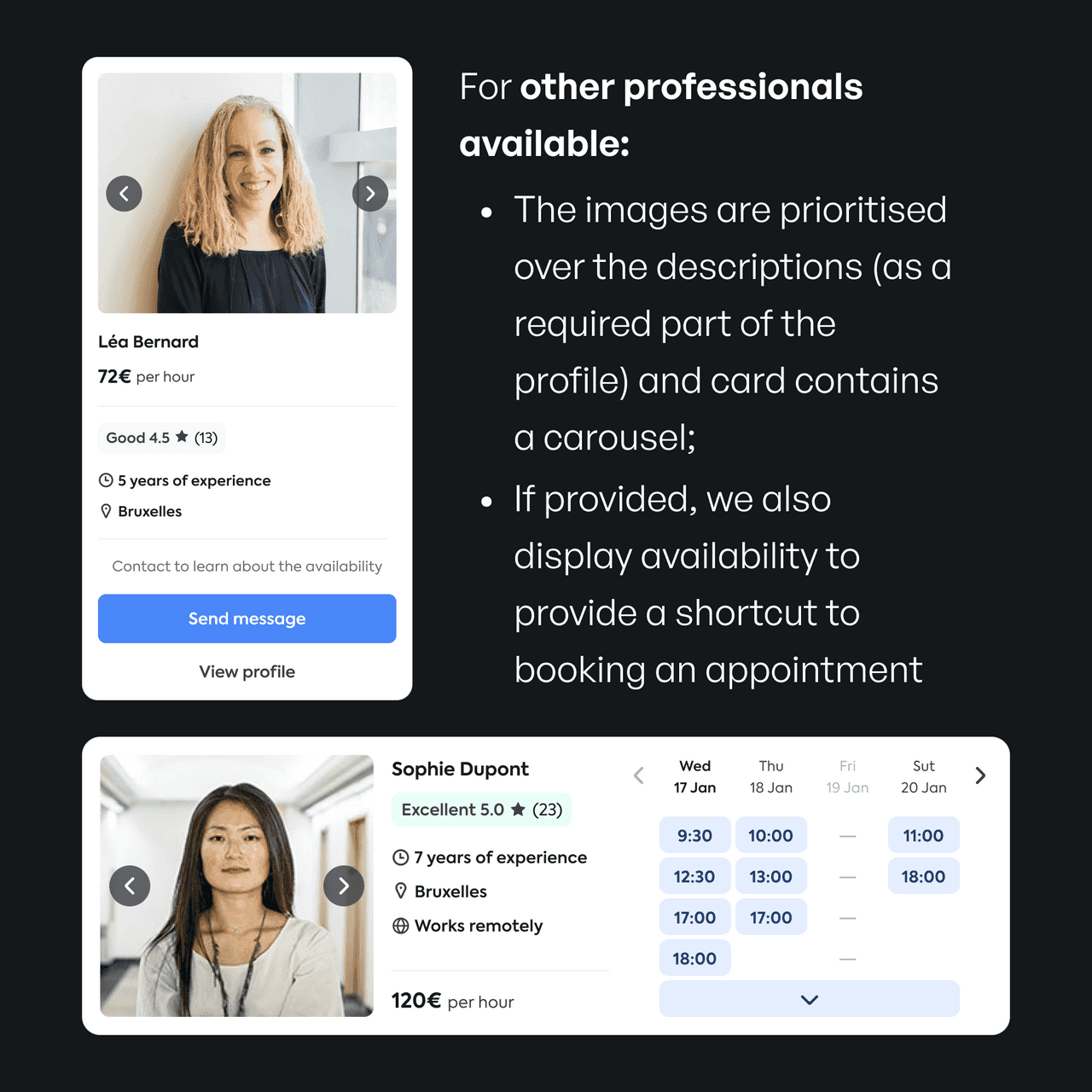
We've ended up with several variations tailored per type of professional or stage of interactions (contacted or not, applying or not, 'bookable online', etc).


It resulted in increased client engagements with professionals and better usability tests feedback.
Target conversion on mobile
~40% increase
Target conversion on desktop
~25% increase
#2
Architecture transformations
Finding common ground
Problem
The initial Project Overview layout presented challenges for clients during the professional selection process. Usability interviews and user recordings revealed difficulties in:
The overall layout felt cluttered and overwhelming, hindering clear decision-making.
Distinguishing contacted professionals
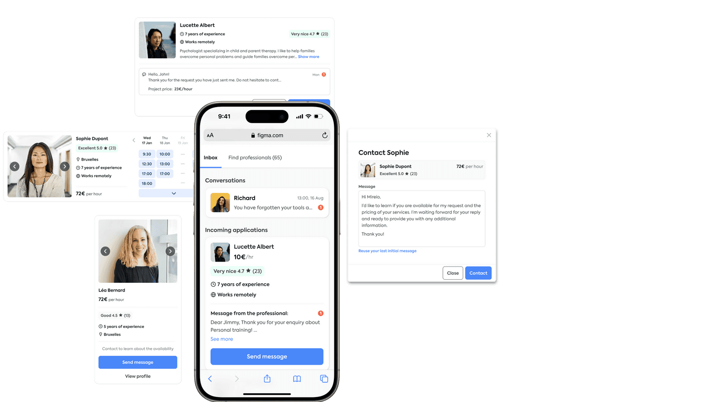
A single list of all professionals with more distinctive cards, clearly divided by the level of interaction.
Information overload
Process
To address these issues, the CTO and I developed two contrasting hypotheses for improving the layout:
Maintain the single-page structure but enhance the distinctiveness of professional groups based on interaction level (contacted, applied, etc.)
CTO's
Divide the list of professionals by purpose:
- The "Project space" screen dedicated to communication, showcasing professionals the client has already messaged.
- The "Find professionals" screen for, evidently, finding professionals, displaying all other relevant professionals
Mine
Introduction of Tabs:
- "Inbox": Clearly displays contacted professionals and those who applied to the request.
- "All professionals": Lists all other relevant professionals corresponding to the client's request.
Introduction of redirection and display conditions to treat different use cases in a more efficient manner.
Results
This hybrid layout provided a clearer distinction between communication stages and improved information organisation, ultimately optimising the user experience for client decision-making.
It resulted in increased client engagements with professionals and better usability tests feedback.
Conversion to open profile
85% increase
Conversations with pros started
70% increase
#3
"Open supply"
Design without design
Problem
StarOfService encountered a challenge with limited supply. Requests for unpopular services in smaller locations often yielded no results, creating a dead end for clients and hindering the user flow.
Process
Our first attempt involved expanding the search geography. However, this was poorly received by users and created a foundation of mistakes — clients were booking appointments with professionals from other cities without noticing. So, the problem required an other solution.
At that moment, interactions with the client required a subscription, and there were enough professionals without one. So, we decided to start displaying them to our clients in case we lack subscribed professionals. The initiative was called "Open supply". Usually, their profiles were less compelling and fulfilled, but this approach appeared more efficient than loosening the search query.
Also, it allowed us to use the client's interest as leverage to attract more professionals into the subscription by having a real demand instead of promises of thriving.
To decrease the chances of getting no answer, we encouraged clients to contact more professionals. Apart from cheering hints, we introduced a popup with a placeholder message (or repeating the last sent), allowing clients to declare their interest in professional services in just 2 clicks. And it helped by doubling the number of clients contacting more than one professional.
The next step, which is the introduction of bulk messaging, was postponed due to switching to the other mission.
Results
Open Supply successfully "unclogged" a significant portion of client requests and led to a noticeable increase in Project Overview conversion. While not all Open Supply professionals transitioned to subscriptions, this approach opened a valuable opportunity for client-driven conversion.
Conversations with pros started
x2 increase
Subscriptions started within segment
~70% increase
Results
For about half a year, I have been working on the Project Overview page as a part of the Client funnel optimisation scope. The redesign included:
Segmentation of clients
Page architecture rebuild
Adjustment of the business model
Optimisation of crucial elements and flows
As a result, the share of Clients starting communication with Professionals increased almost in 4 times. This phenomenal number was partially achieved by sacrificing the next funnel step performance, but still, on the scale of the entire funnel, it can be estimated as x2.2 growth.
Target page conversion
x4 increase
Entire funnel covertion
x2.2 increase
There were still ideas for further Project Overview page enhancements, but it was excluded from the Growth team scope as we the entire Client funnel optimisation.
Thank you.
Return to resume